My work
I love what I do, and I’m driven by interesting projects that make a tangible difference to businesses, culture, and the world.
Throughout my career, I’ve worked across sectors and industries: government, charity, FMCG, hospitality, banking, food and beverage, pet care, restricted products, sport.
But certain sectors always seem to find me, and over time I’ve carved out specialisms in real estate, destination and hospitality branding, and professional services.
Case studies
Royal Kennel Club
Driving a reappraisal through a name change
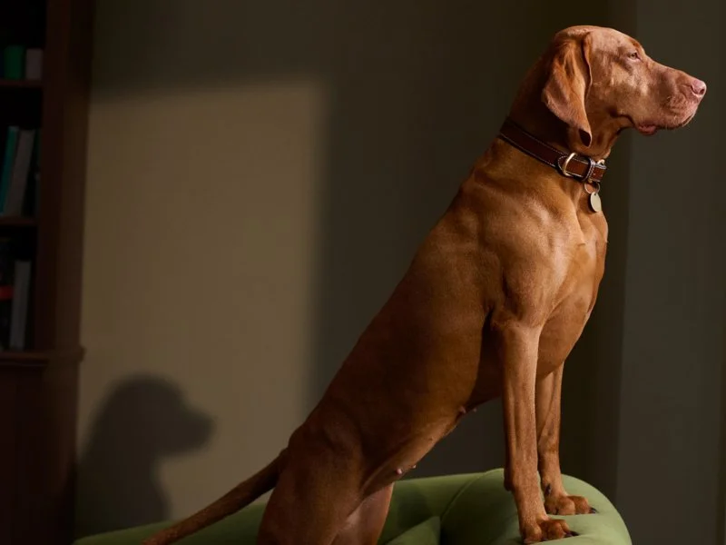
When the Kennel Club became the Royal Kennel Club, it did so at a time of relative turbulence for both the club and the royal family. The former – an historic institution with an old-fashioned way of doing things – was struggling to prove relevance in today’s dog ownership community. The latter was struggling with Prince Andrew.
For the Kennel Club, its new royal status presented an opportunity for a brand refresh and reappraisal. The challenge was obvious: the word ‘royal’ ran the risk of exacerbating the problem.
My role was to find a resonant message in the name, relating it back to the amazing things that the Kennel Club does and no one sees. The answer was in emphasis. Rather than insist that an already dated-seeming institution was ‘royal’, the light was turned on the dogs themselves; they are royalty in every dog lover’s life. The positioning for the Royal Kennel Club became at their service, with all focus on the work the organisation does to keep dogs in ‘their rightful place’.
TGI Fridays
Reviving a once loved brand that dined out on nostalgia
Most of millennials and Gen Xs have nostalgic memories of TGI Fridays. It was once the go-to first date location for love-struck teenagers, or the lively cocktail bar for those still getting used to drinking without adult supervision.
The problem is, for a while now the experience hasn’t reflected the nostalgic promise – and anyone drawn in by the excruciating memory of their first kiss will be disappointed not to find the energy and noise of the glory days.
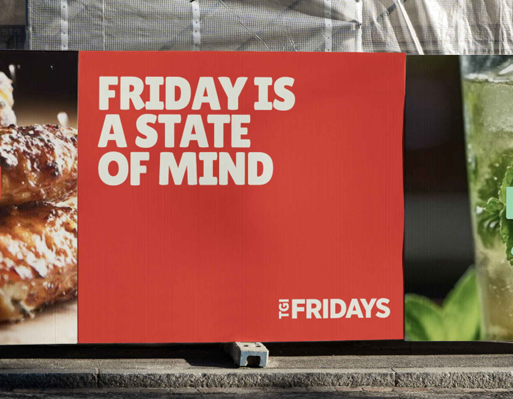
This project was a hail mary. TGI Fridays needed to relocate its mojo quickly, and my role was to define the positioning to get there. Rather than leaning entirely into nostalgia, the strategy was to reclaim the Fridays feeling in a post-pandemic world. Friday may have lost its supreme celebratory status, but the TGI Fridays brand still exists to bottle that spirit of relief, primal joy, and anything-goes enjoyment – and serve it up every night of the week.
SOWN
Creating an aspirational shared ownership brand
Shared ownership has always had a mixed reputation; viewed by some as the only way to get onto the property ladder, and viewed by others as a scam. Regardless of where you are on this scale of opinion, there’s one truth that most will agree on: it’s not as good as full ownership.
And until recently, pretty much everything in the way shared ownership brands were presented existed to remind buyers that they are compromising. Patronising messaging, cheap and stocky photography, childishly presented type and graphic language – the list goes on.
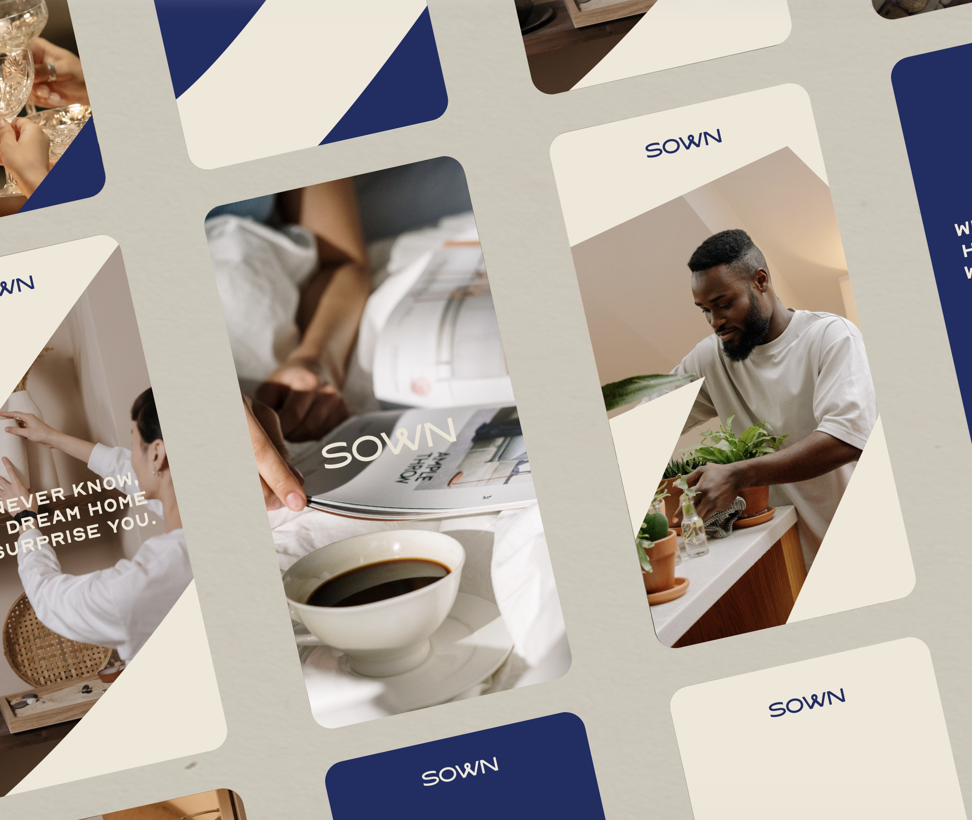
When Leaders Romans Group launched its shared ownership brand from scratch, it wanted a name and identity that didn’t do this. My goal was to define a brand that actually felt aspirational. This started with strategic foundations that avoid stereotyping lower-budget buyers, and a name that infers positivity (the s from shared combines with own to indicate foundational growth). Then the brand world followed, built to feel premium, inspiring, and actually desirable.
Chelsea Barracks
Repositioning one of London’s quietest, most affluent neighbourhoods
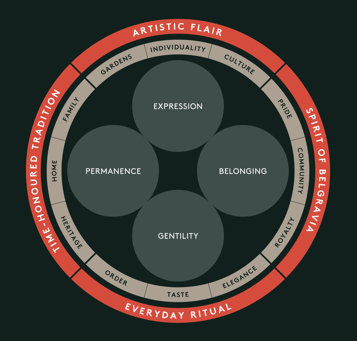
Most haven’t heard of it – and quite deliberately. Chelsea Barracks is the jewel in Qatari Diar’s London portfolio, and sits opposite the Royal Chelsea Hospital. Apartments start at £6m and townhouses reach to £60m.
While the developer has never struggled to justify the price-tag, building a sense of community and culture has been a slower journey. Residents are split between cities around the world, and painfully private.
This project was to protect privacy while driving the right kind of footfall to area – using brand, tone of voice, and place activation to literally bring Chelsea Barracks to life. The work started with positioning and strategy, moved into wayfinding, signage and resident communication, and spread into how the development relates to – and activates – its surrounding neighbourhood.
Veygo
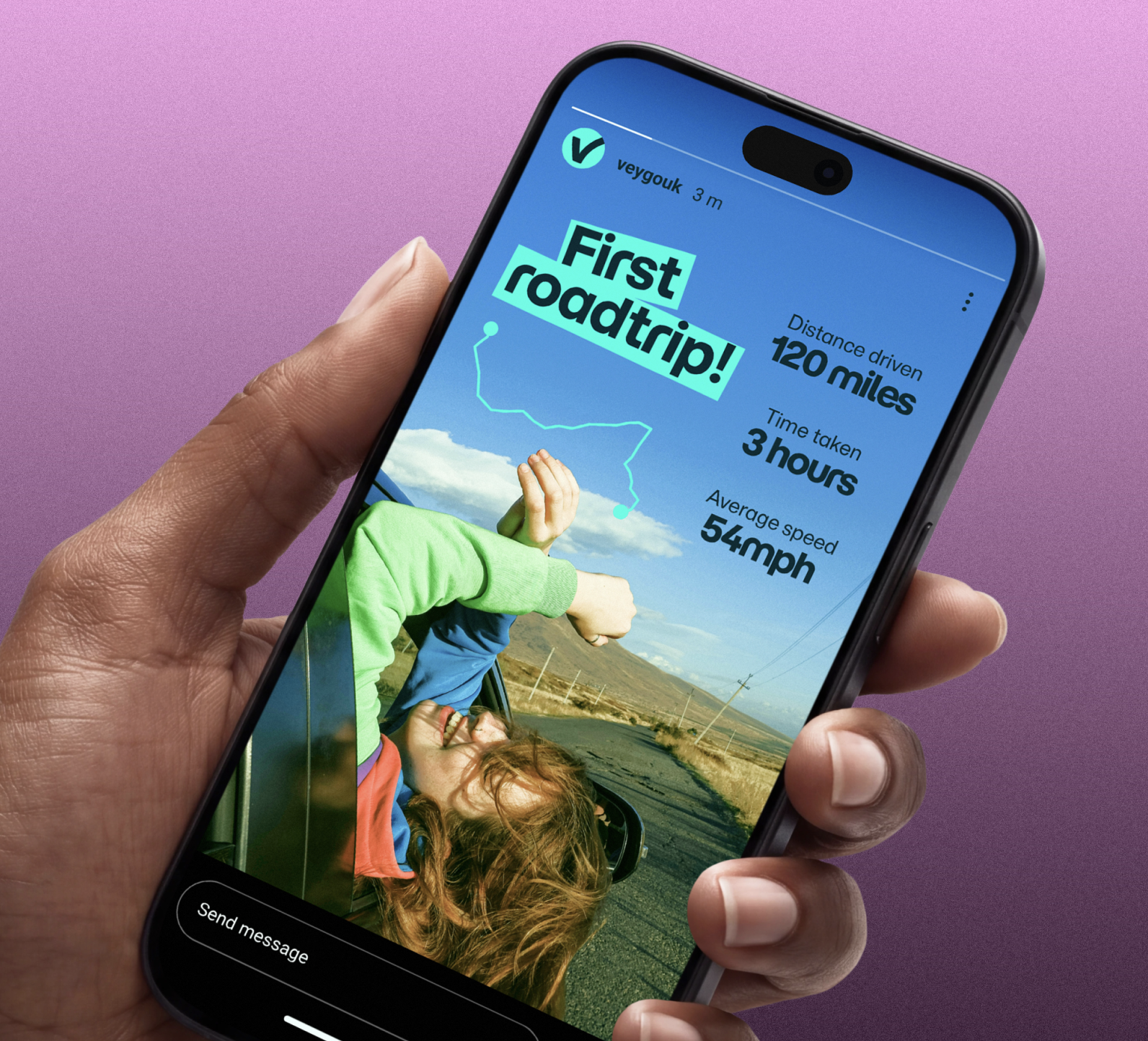
Turning pay-as-you-go insurance into a Gen Z lifestyle
Motor insurance rarely gets anyone excited – especially the transactional, pay-as-you-go kind that covers you for a borrowed car perhaps once every other year.
This was Veygo’s problem. A short-term insurer, backed by Admiral, that had found its ceiling in both customer base and customer relationships. But one opportunity loomed large: young drivers.
For learners or newly qualified drivers, pay-as-you-go insurance gives the keys to practice sessions in Mum and Dad’s car, to nipping out in-between uni terms, or to taking friends away on the first big road trip. In essence, it offers the keys to independence; a coming of age.
This project teased open this emotional space, and filled it with a positioning and identity that felt liberating, authentically Gen Z, and yet – importantly – reassuringly serious for concerned parents.
General Motors
Optimising call centre scripts for OnStar
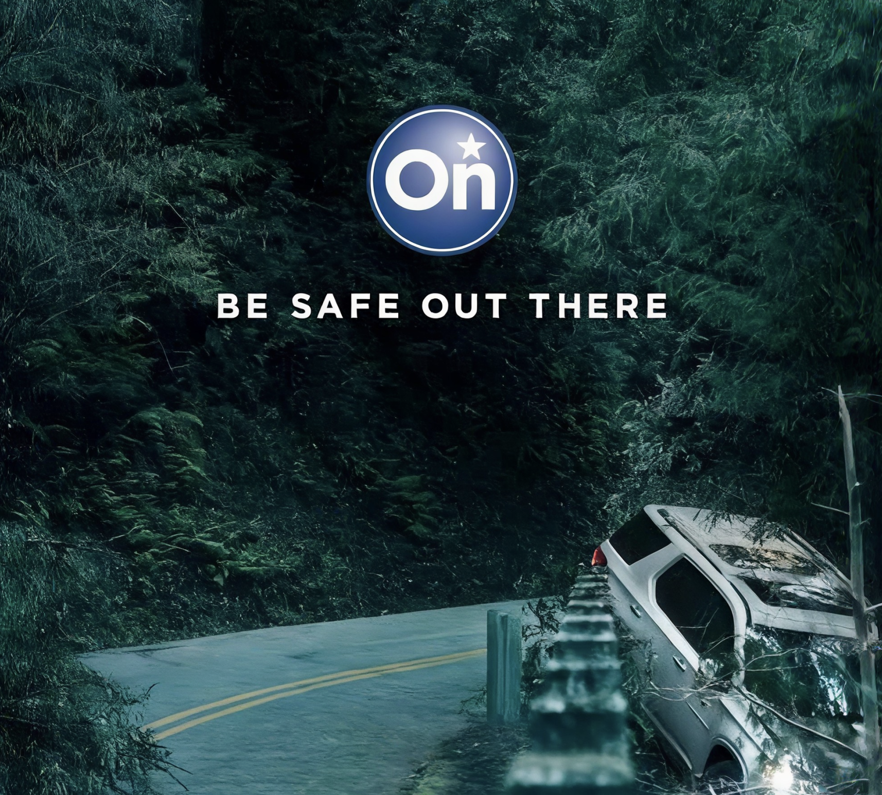
OnStar is a paid subscription service in-built into General Motors cars from the moment they’re driven off the forecourt. It comes with perks – a data package, in-car entertainment, navigation – but at its core it is a safety service. If your car comes off the road, the OnStar call centre is notified, and they will speak to you in the car, and contact the emergency services on your behalf, if needed. It’s the ultimate insurance package.
The problem is, how do you persuade a new car owner to pay for a product they hope they’ll never need?
This project was built on the principles of behaviour change and persuasion, working directly with call centre staff on the ground in Oshawa, Canada, to find the perfect words for OnStar subscriptions. My goal was to optimise sign-ups and prevent cancellations – all without taking the shine away from the new car feeling. After three months of on-site development, the completed scripts generated 2.5% more subscription sign-ups, and saved 3.1% more cancellation calls.
Mayakoba
Transforming a corporate title into a destination brand
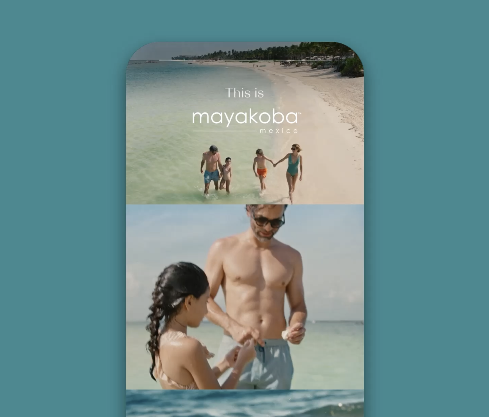
You can find Mayakoba on the east shores of Mexico, not far from Cancun. Until recently, it was a place name with little meaning; a collection of luxury hotels brought together by a corporate enterprise, RLH Properties.
The opportunity for RLH was to make more of this location. With four hotels connected by a private lagoon inland, and facing sparkling white beaches at sea, the area – Mayakoba – needed a destination identity that could earn it vacation status alongside resorts like the Hamptons and Napa Valley.
This project was to do exactly that. Observing a competitive landscape where every Mexican resort points outwards, towards the sea, I chose to point Mayakoba inward. The secluded networks of turquoise waterways set Mayakoba apart, so the positioning and identity was built on the concept of life by the lagoon; a lifestyle with a distinctive aesthetic, pace and offering.
LHH
Humanising and connecting a global talent business
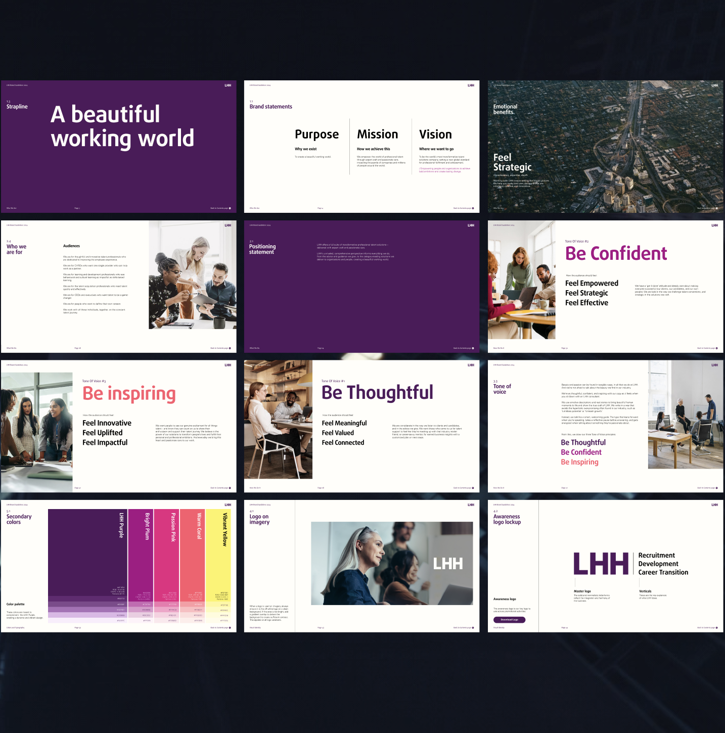
LHH is one of the largest talent companies in the world. Spanning recruitment, outplacement, coaching, executive services, and graduate support, what LHH has in breadth and scale it lacked in specificity and purpose.
This project gave LHH its meaning. For three years, I’ve worked closely with the LHH team to define a core positioning that unites the business, makes sense of its offering, and gives it emotional resonance in a sector that more often feels cold and transactional.
The positioning? A beautiful working world. A brand platform built to convey the breadth of LHH’s offering, while reminding the world that work can – and should – be beautiful. In three years, this has been to life across brand positioning and identity, a launch brand campaign, and a dedicated recruitment campaign.
Crufts Club
Turning a well-known show into a subscription service
85% of people in the UK have heard of Crufts. Most of us have met it on Channel 4, on a Sunday afternoon in March, observing perfectly groomed pedigrees strut around an arena. The show has mass appeal as a form of soft entertainment. But as a paid subscription service? It’s a touch less relatable.
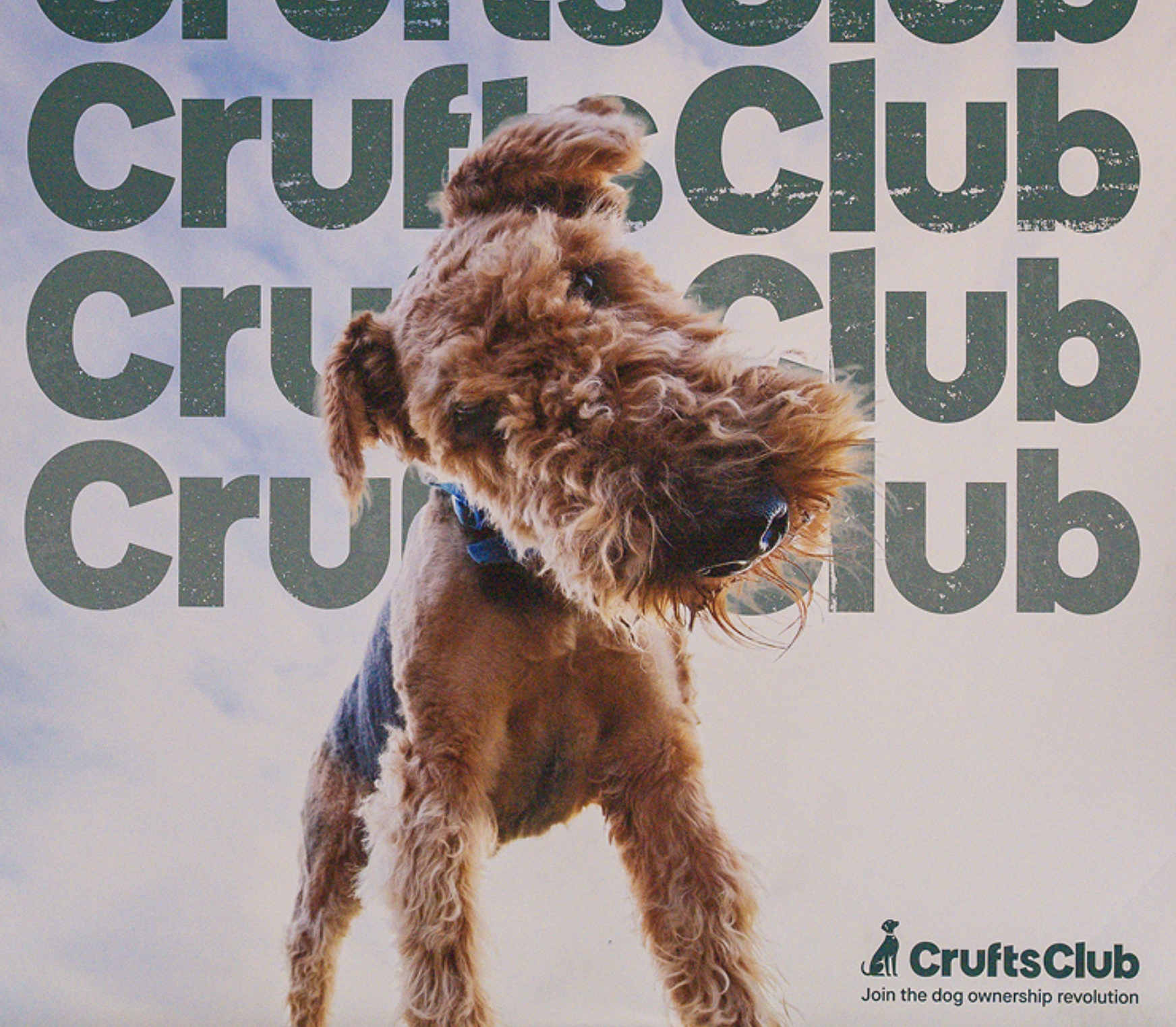
This was exactly Crufts’s challenge when they launched Crufts Club. The club has clear commercial intentions; a way to monetise the Crufts offering year-round, and a way to bring the brand to life beyond Channel 4 and the NEC. Yet its offering – training programmes, rewards, instant vet services – are difficult to get across when perceptions of Crufts are so fixed.
This project was to establish the positioning, creative identity and launch campaign for Crufts Club. Launching at Crufts itself, the campaign needed to be loud in a noisy environment, and needed a clear point of view on why the product even existed. The answer came in revolution. Uniting pet care and behaviour services that have historically been disconnected, Crufts Club was positioned as the driving force of change; shaking up what it means to responsibly own and look after a dog. The message was revolution, the creative style was guerrilla, and the strategic underpinnings kept Crufts connected to pushing for the very best in dog care, health and wellbeing.
This Time Tomorrow
Defining a new kind of aparthotel
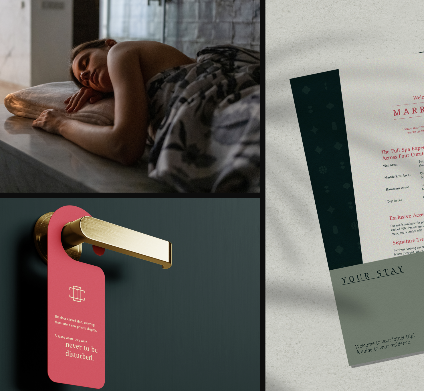
This Time Tomorrow is an aparthotel concept with a difference. Whole apartments available for short stays, yes. Fully serviced with 24-hour concierge, yes.
But the difference comes in the detail: lovingly renovated historic buildings in the heart of Florence and Marrakech, adorned with local art, furnished to perfection, and ‘off-menu’ experiences customised by a concierge team who act more like curators.
This project was to build a whole brand that conveys this difference, without deferring to category cliché. The brand was consciously and deliberately not a ‘home away from home’. Instead, the positioning was built around a promise of going ‘off-menu’; an invitation to experience a different side of the city – one that a standard hotel or Airbnb could never provide access to. In this, the brand coded for special access, and an experiential side of luxury that spotlights simple good taste.